Case study
Maison Lumière
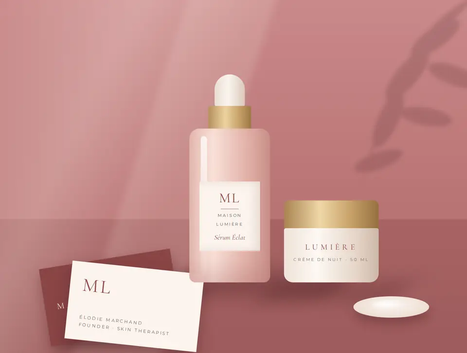
A quiet-luxury identity for a boutique skincare studio. Wordmark, palette, packaging and stationery designed to feel as calm and considered as the treatments themselves.
Client
Maison Lumière
Service
Brand identity & logo design
Deliverables
Logo, palette, packaging, stationery
Timeline
6 weeks
Overview
Calm, considered, quietly luxurious.
01
The brief
A new skincare studio needed an identity that felt premium from day one: something that could sit on a serum bottle, a treatment menu and an Instagram post without losing its calm.
02
The approach
A widely spaced serif wordmark, a warm rose palette with gold-foil accents, and a simple ML monogram that works at any size, from wax seals to shop signage.
03
The result
A complete brand system with guidelines, so every new product, menu and post looks like it belongs.

Primary wordmark, monogram and gold-foil lockup.
Colour, type and paper
Rose and clay for warmth, gold foil for the moments that should feel special, and a serif that reads like a handwritten note.

Palette and type: Cormorant Garamond with Montserrat.

Stationery: letterhead, cards and a wax-sealed envelope.
How it came together
From first call to final files
01
Discovery
A questionnaire and call about the studio, its clients and the feeling a visit should leave.
02
Concepts
Distinct logo directions shown on real mockups: bottles, cards and the studio door.
03
Refinement
The chosen direction polished through revision rounds until spacing and colour felt right.
04
Brand system
Guidelines, packaging files and print-ready stationery delivered in every format needed.
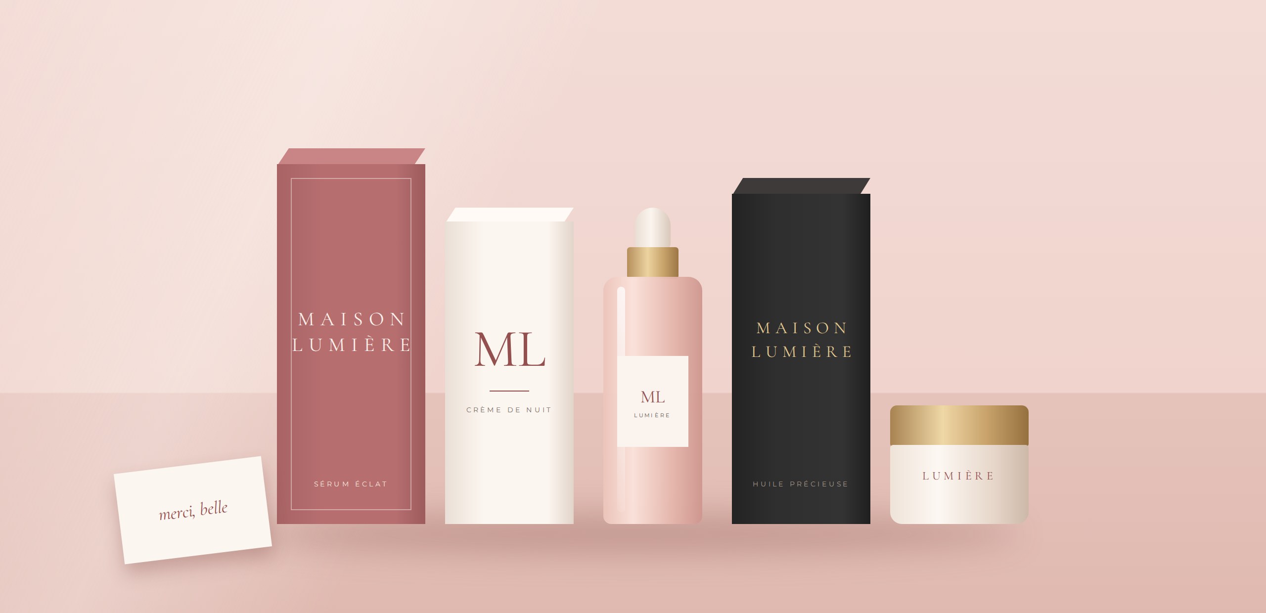
Packaging range in rose, ivory and noir with gold-foil details.
What was delivered
Primary wordmark & monogram
AI · SVG · PNG
Colour palette & typography
HEX · CMYK
Packaging for three products
Print-ready PDF
Stationery suite
Print-ready PDF
Brand guidelines
The service behind this project
Brand identity & logo design
See what's included, how the process runs and the packages available.
Explore the Service →Keep exploring
More work, by discipline
Like this project? Let's build something people remember.
Tell me about your brand, your goals and your timeline. I'll come back with ideas and a clear plan within two working days.